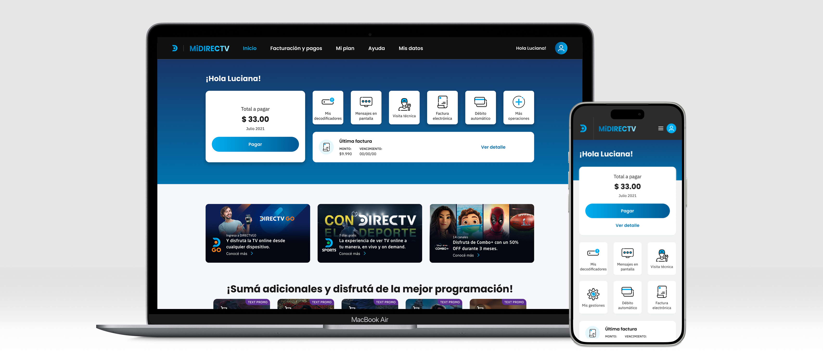
DIRECTV's satellite ecosystem was split across Public Sites (pre-purchase) and MiDIRECTV (post-purchase, web & app) — each with its own UX and UI teams, working independently toward the same goal. My job was to align them.
Overview
DIRECTV's satellite business is split across two platforms: Public Sites, the web experience for everyone before they become a customer, and MiDIRECTV (web and app), the experience for everyone after they do. Each had its own UX and UI teams, working independently — and, on paper, toward the exact same business goal.
In practice, that independence meant the two sides told the same story in different ways: same content, different UI; same intent, different flows — even between web and app within MiDIRECTV itself. My role was to work across both teams, in parallel, and align criteria, flows, and UI adoption without slowing either one down.
Problem
Each team worked independently, even though they ultimately served the same customer and the same business. The inconsistency showed up at two levels — visual and experiential — and had a different root cause on each side.
Same cards, different UI. Same product, different flows for web and app. Two teams building for the same customer, describing it two different ways.
Process
01
Started separate daily syncs with UX designers and UI designers across every team — first just to get people talking, then to build real cross-product, cross-team communication.
02
With UI, that meant surfacing every unmet need in the paused design system. With UX, it meant reviewing satisfaction surveys, channel comments, and CX research findings across both platforms.
03
Crossed the pre- and post-purchase experiences into a single journey map, and segmented users by what they'd actually contracted — Satellite TV, DGO TV Online, Internet, or Internet + DGO.
04
Consolidated 26 issues, ranked by business criticality. Designed against the highest-impact ones first, then tested the new proposal with real users to confirm what actually moved the experience.

Journey map crossing Public Sites and MiDIRECTV, segmented by contracted package — the 26 issues found are mapped against each stage
Solution
Nothing here started with a redesign — it started with people talking to each other. The concrete work followed once both disciplines had a shared forum: UI rebuilt the design system into something worth adopting, and UX closed the blind spots between platforms.
Sat with each UI team to hear exactly where the paused system fell short — which components they needed that didn't exist, and which ones they'd already built themselves out of necessity.
The same package card existed in several structurally different versions across teams. Consolidated these into single, shared components instead of picking one team's version as the "winner."
Instead of freezing again once the gaps were closed, I treated new component needs as ongoing demand — adding to the library as the project kept scaling.
Crossed the Public Sites and MiDIRECTV experiences into a single end-to-end journey map, and segmented users by what they'd actually contracted — Satellite TV, DGO TV Online, Internet, or Internet + DGO.
Closed the blind spot at the handoff from Public Sites to MiDIRECTV — the point where neither team previously owned the experience.
Rebuilt account creation and login against the 26 issues surfaced by CX research and satisfaction survey analysis, prioritized by business criticality and validated with real users.
Results
These figures are illustrative — modeled on the shape of the convergence rather than exact reported numbers — but they reflect what actually changed: the design system went from optional to default, and the issues CX had been logging for years started closing.
Modeled on design system usage tracking and the CX research/survey pipeline over the project period. Adoption is measured as the share of shipped UI built from shared components rather than one-off constructions.
The biggest shift wasn't a component or a flow — it was that both teams stopped treating the handoff between platforms as someone else's problem. Once UX had one map and UI had one system, the "same thing, said differently" problem stopped being true.
Reflection
The fastest fix here wasn't design work at all — it was getting UX and UI from both platforms into the same room, on a recurring basis. Everything downstream, the unified components and the closed blind spots, only happened because that communication kept going instead of stopping after the first alignment meeting.
19 of 26 issues down still leaves 7 on the table, and the design system doesn't stay adopted on its own. What's next: