
A funnel analysis turned into a full redesign of the Direct-to-Consumer subscription flow — fewer screens, a clearer login, and a flow re-architected to convert better across every business model.
Overview
After shipping FOX Play across five platforms, the next challenge was conversion: getting more of the people who installed the app to actually subscribe. The starting point was data, not intuition — an AppsFlyer-based funnel analysis that showed exactly where users dropped off between install and purchase.
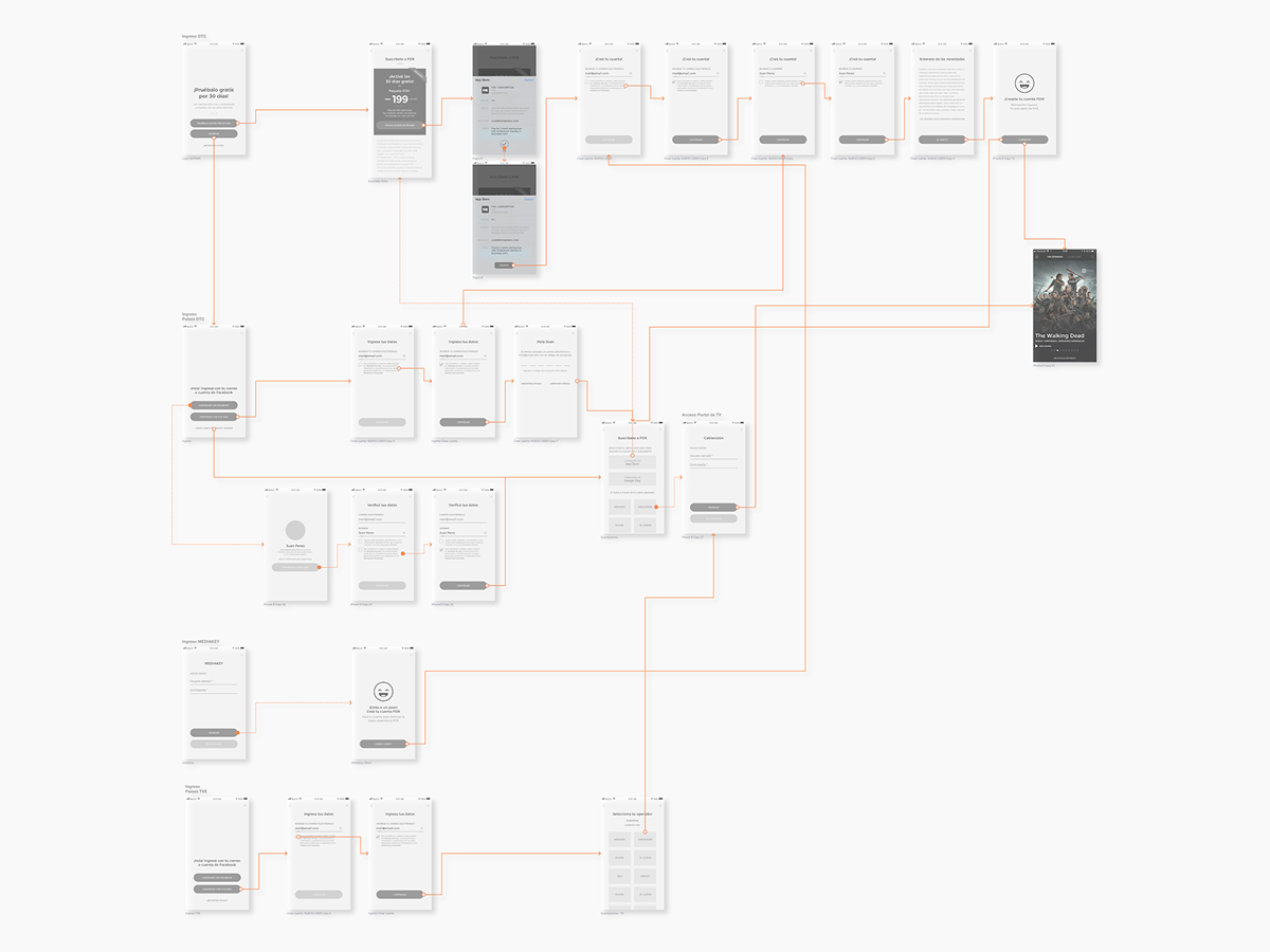
What it revealed pointed to something structural: the subscription itself took no more than 3 steps, but it always sat after a registration process — the opposite order of what tends to convert best. The proposal that came out of this was a new DTC (Direct-to-Consumer) flow, inverting that order while still supporting three different business models at once: TVE, B2C, and DTC.
Problem
The retrospective funnel analysis (AppsFlyer, Mar–Jul 2018) showed a clear pattern: users dropped off steadily from install through to purchase, with the steepest fall between adding a package and completing the order.
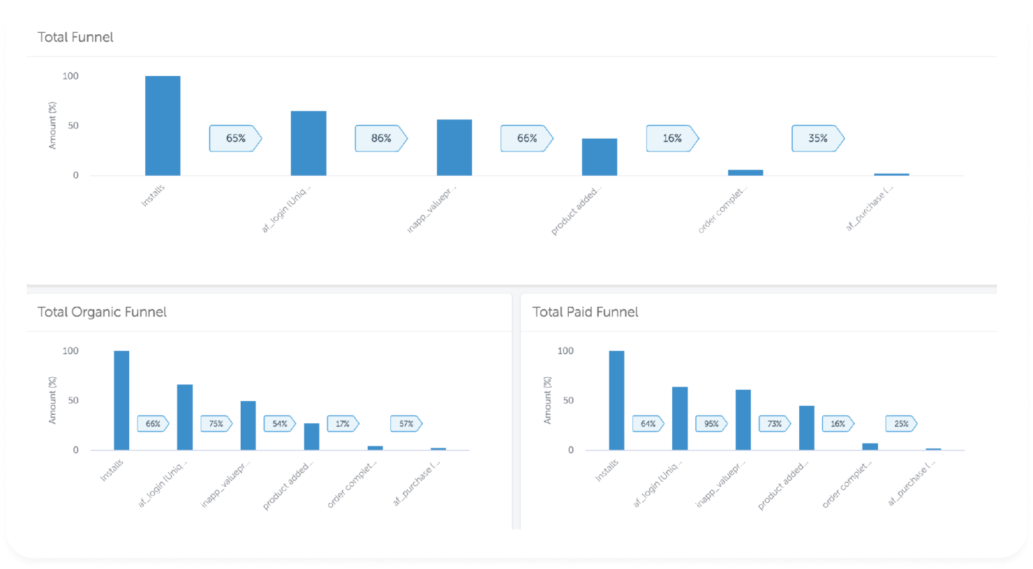
Fuente: Appsflyer – 1 Mar al 31 Jul 2018
Three things stood out once I broke the data down further:
The structural issue underneath all three: the subscription itself needs no more than 3 steps, but it always comes after a registration process — the opposite of what tends to convert best. Inverting that order meant redesigning the flow to support all three models — TVE, B2C, and DTC — at once.
Process
01
Audited the full acquisition funnel with AppsFlyer data, breaking it down by organic vs. paid traffic to isolate where the drop-offs were about UX friction versus user intent.
02
Proposed a new DTC flow, inverting the order to offer the subscription before registration — while keeping it compatible with the TVE and B2C models already in place.
03
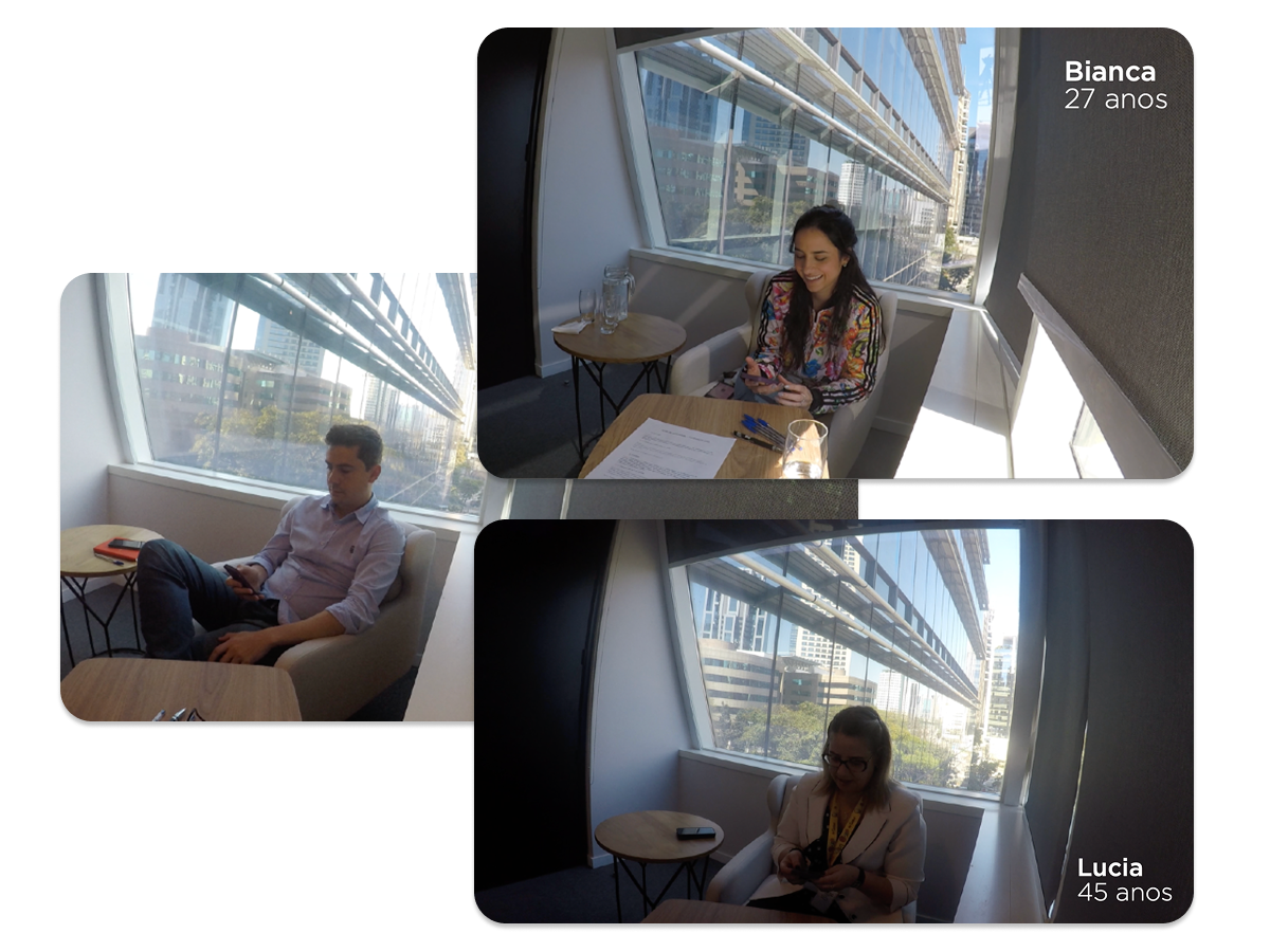
Ran interviews and a moderated usability testing round in Brazil on the new flow proposals, iterating on the design as I went. The scope also covered the integration of alternative login methods.
04
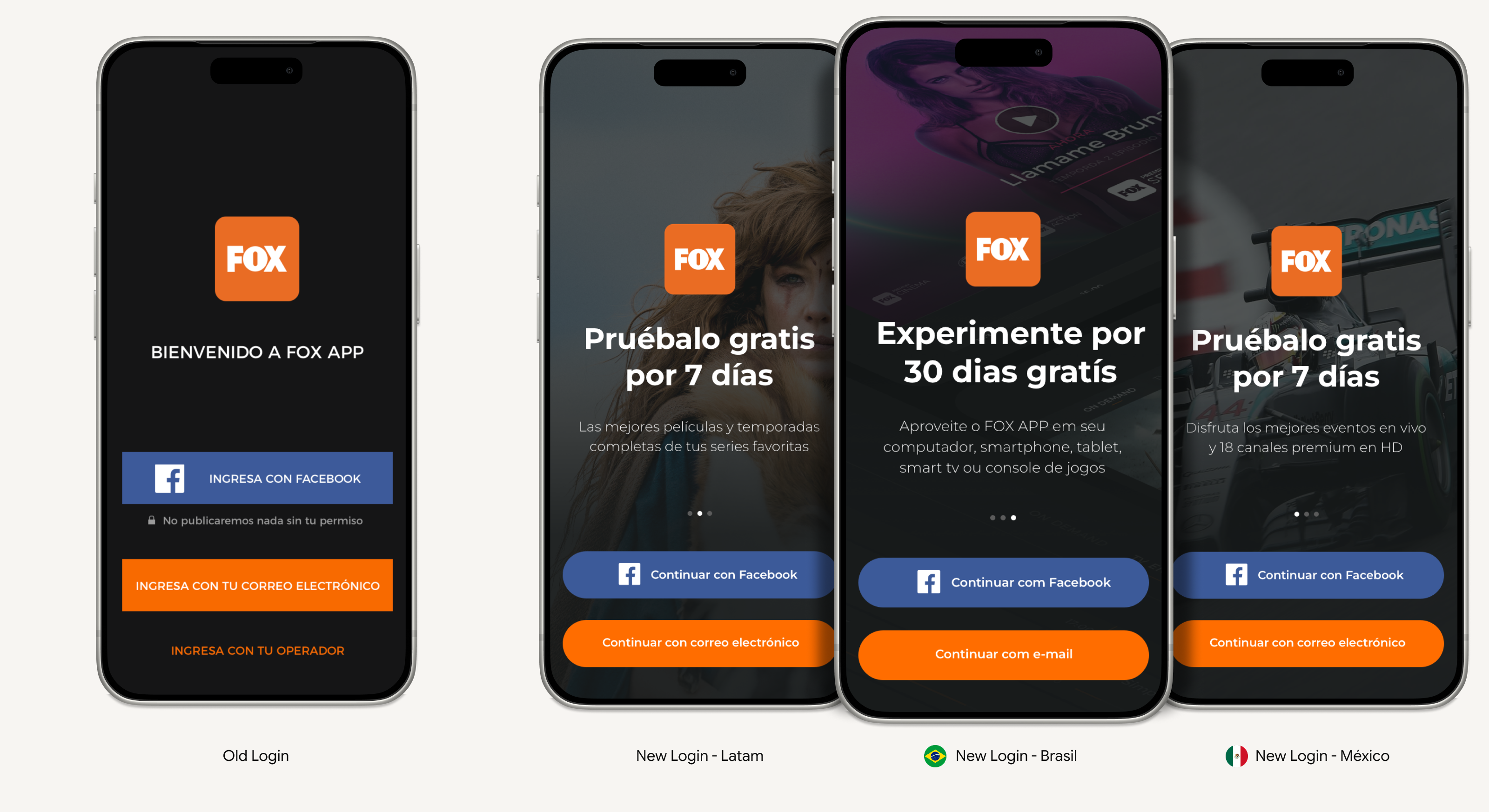
Replaced a 6-screen static onboarding with a single interactive screen, and rebuilt the login screen to sell the product's value instead of a generic welcome message.
Before locking the new flow, I ran moderated usability testing with real users in Brazil. Not every finding led to a change — but each one got a decision, not a shrug.
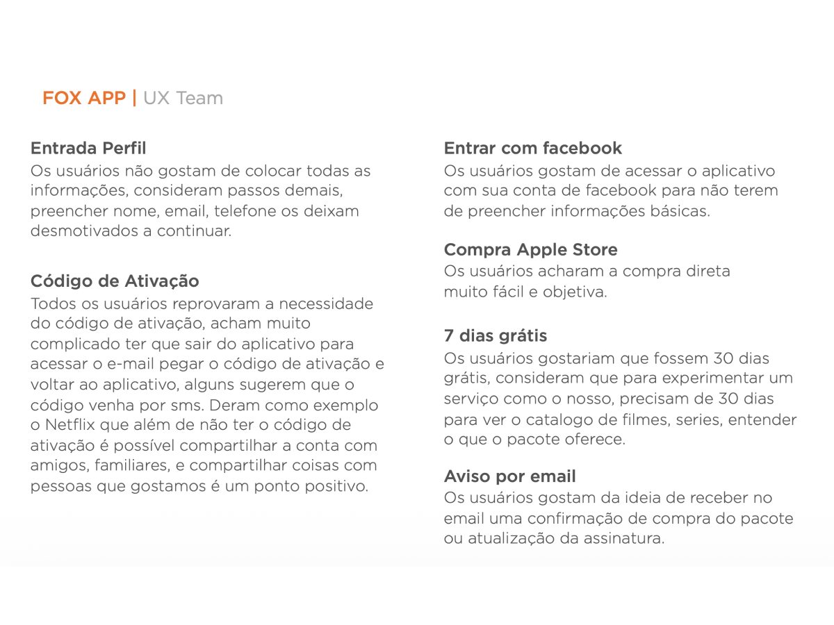
Finding — Login profile
Users don't want to fill out a full form — name, email, and phone felt like too many steps before getting anywhere.
Finding — Activation code
Every user pushed back on the email activation code — leaving the app to find it and typing it back in felt like a dead end. A few pointed to Netflix, which skips this entirely.
Finding — Login with Facebook
Signing in with Facebook was the clear favorite — it meant not having to type in basic information at all.
Finding — App Store purchase
The purchase step itself wasn't a problem — users found it fast and straightforward.
Finding — 7 days free
Most users said 7 days wasn't enough to judge a service like this — they wanted 30, to actually get through the catalog and understand what the package covered.
Finding — Email notification
Users liked getting an email confirming their purchase or plan upgrade — it gave them something concrete to point to.
Also under analysis, beyond this redesign's scope: multiple cross-product subscriptions, and in-app subscription for Apple TV and Android TV with EV-style "Servicios" views.
Solution
Based on user testing and the metrics analysis, five changes came out of this work — each aimed at removing a specific point of friction I'd identified in the flow.
The old onboarding required 6 screens before a user could even reach login and create a profile. The new onboarding condenses this into a single interactive screen, with video content specific to each country.

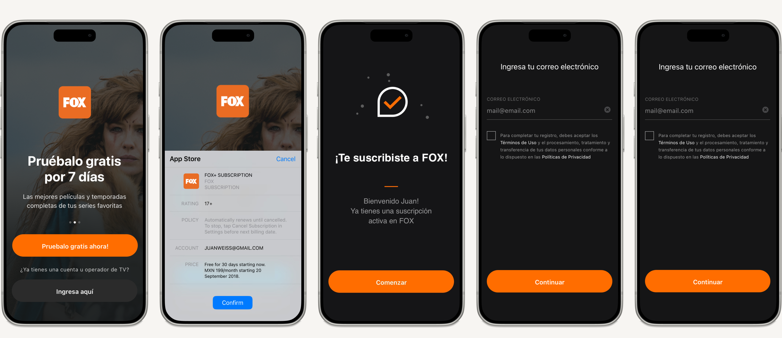
Direct path from onboarding straight into profile creation + subscription
Results
These figures are illustrative — modeled on a representative monthly cohort rather than exact reported numbers — but they reflect the real shape of the improvement: a shorter, clearer path from install to purchase moved every metric in the funnel, not just the ones I targeted directly.
Modeled on a baseline of ~140K monthly installs, held constant across both scenarios to isolate the effect of the flow changes. Newsletter opt-in improvement reflects moving from a pop-up (high dismiss rate) to an inline checkbox next to the Name field.
This work marked a shift from designing individual screens to designing around a funnel — treating onboarding, login, and every screen in between as one connected system to be measured and iterated on together.
Reflection
The biggest shift for me on this project wasn't a screen — it was starting from the funnel instead of a feature request. Every change I shipped, from the onboarding screen count to where the newsletter checkbox lived, traced back to a specific number in that AppsFlyer chart. That discipline — let the data point to the friction, then design against that specific point — is the part of this work I've carried into every growth-adjacent project since.
It also left a clear map of what wasn't solved yet. The funnel redesign fixed the path to a first purchase; it didn't touch what happens after someone subscribes, cancels, or lapses. That's the natural next phase of this work:
None of this was built in this phase — it's the roadmap this project set up, not the work it shipped. But it's a fair measure of what a good funnel diagnosis is worth: it doesn't just fix what's broken, it tells you what to build next.